Tilted Sun Concept Art: All About Line Art!
/Welcome to a look behind the scenes at Tilted Sun! This blog features line art before it is colored and arranged in the final production, as well as some process notes!
When making Sam, I wanted him to be a bit unseeable in the earliest parts of the comic, where most of his face would be covered by a hood, goggles, a scarf, and his hair. As time goes on his face and his character get more exposed throughout the story.
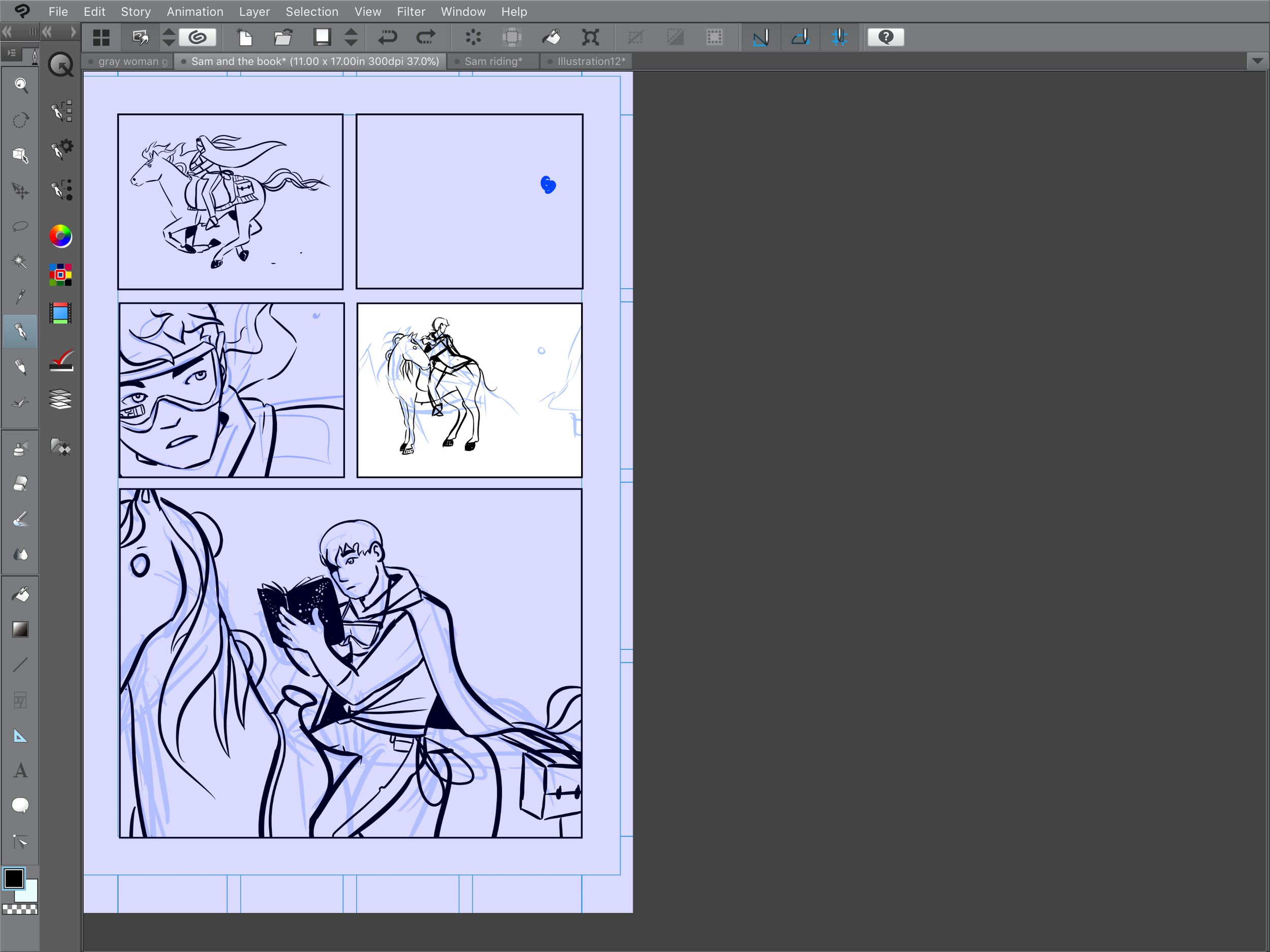
I tend to make drawings in a separate document in Clip Studio Paint and then copy and paste drawings into their designated panels. This process helps me feel more free, it also allows me to adjust framing. If the drawing is always separate from the panel, it's easier to feel better about moving the drawing around inside of the frame. There's no bias about initial composition or placement being better. I'm sure that this process looks ridiculous to many comics pros, but it works for me.
Also, I almost always draw with references, with the exception being the Gray Woman and Sam's faces and other character faces. Logger Bird and Orsyn are all drawn from resources such as photos of birds and horses.
On very specific objects things fall apart if I don't user references - for instance: The Gray Woman's impersonator gun is some kind of rifle, and made the mistake of trying to draw the Impersonator without a reference photo and wow it did not turn out so well:
Seriously I could not draw a gun without looking at one to save my life.
Here are a couple cat sketches, all of which are based off of my grandpa's two cats, Flash and Xena.
Later in part 1 a character shows up with a skull for a face. I couldn't bear to fudge the skull or make up parts of it, so I drew from a real raccoon skull. It turned out to be rounder than I thought - sort of between a cat and a dog.
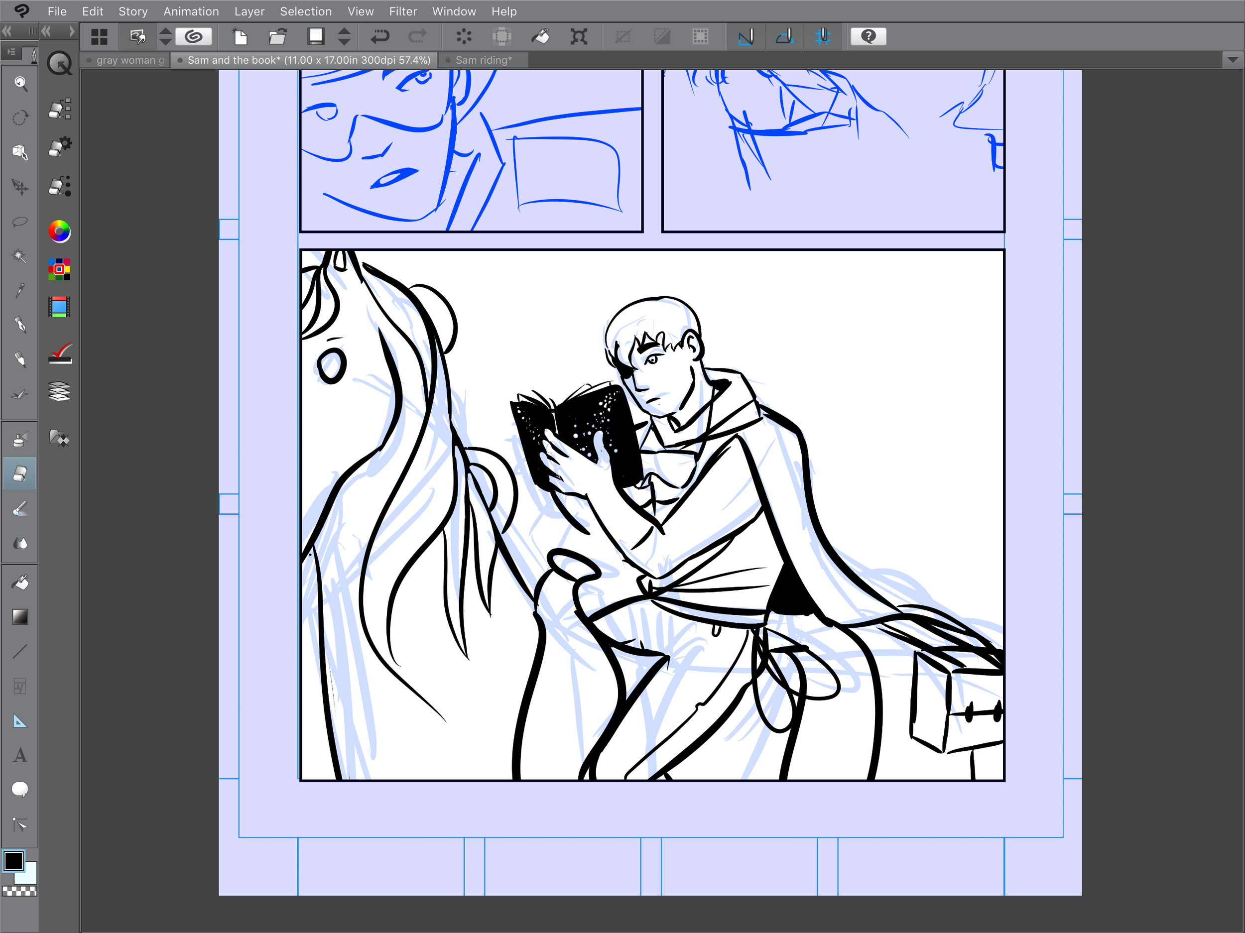
As far as how line art is made, it doesn't start out perfect! I usually sketch out ideas on a light blue bottom layer, similar to sketching out ideas in traditional comics creation in blue pencil. It's fun to use sketches to get a feel for weight, direction, and motion. I can't exactly put into words what I do when I draw, but the best way to explain is in a question. I ask myself: "What does this comic want to do" and from there the art takes over.
The image above and the image below are both screencaps from Clip Studio Paint (or Manga Studio) on the iPad Pro. You've probably heard me rave about this software before. These screencaps show how I work from blue line into an inked layer or final layer of line art. Nothing at all starts out perfectly, there are a lot of scribbly failed ideas on that bottom layer.
Seriously Clip Studio Paint is so baller.
Since Tilted Sun is in full color, the line art holds a lot less shadow than traditional comics and it's a bit less dramatic. Still, there are moments though where black becomes a powerful point of conceptualization - the stronger the line art, the stronger the final panel.
Comics are an exciting medium in that everything matters - color, line, lettering, panels. Aside from a single two-page comic in an anthology, Tilted Sun is my first comic, so I am learning as I go. It's one thing to read and experience comics, it's a separate beast to create them. As time goes on I'll keep sharing blogs like this one - I'll be as honest as possible because I don't believe that the fake-it-till-you-make-it mode of living helps anyone be a better artist. I don't even think it helps people enjoy art!
While I am bringing my traditional art skills to the drawing table, comics production is still very new for me. Stay with me, I promise you it will get even better. :)
Becky


