It's been way too long since my last update
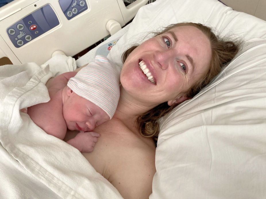
/Life update: From 2021-2022, I was pregnant and I had a baby!
I look forward to updating Tilted Sun more often and getting back in the saddle with comics.
Thanks for reading Tilted Sun!
There are worlds beyond this one...
Blog posts, news, and media about Tilted Sun
Life update: From 2021-2022, I was pregnant and I had a baby!
I look forward to updating Tilted Sun more often and getting back in the saddle with comics.
Thanks for reading Tilted Sun!
On January 21 of 2020, Tilted Sun went on hiatus - what was going to be a two-week break turned into a year and half where we all went into the dark and narrow tunnel of coronavirus. The tunnel has expanded into a grand cave, full of terrors and sparkling gemstones alike.

In the spring of 2020 I got super into fitness in my yard in the DMV
I’ve recapped a bit of what I’ve been up to on my core blog, but here’s what I’ve been up to on a large scale.
During the spring of 2020 I wasn’t sure what to do with my time, so I poured a lot of energy into exercise and running. Minus DC parties and going out with friends due to covid restrictions, I didn’t think drinking beer in my yard in Maryland-shy-of-DC was fun any more, so I quit drinking around June 1 of 2020.
During the summer of 2020 it became clear that DC wasn’t going to be the place for me, I ended up selling my house and moving back to Boulder, CO, a place I have always loved and the place where I got both my degrees.

Painting plein air in Boulder
Boulder is a great place for me to be, as it’s a place that I already know and have already come back to once before. It’s much better to live here as a 30 something and not as an incredibly poor student, which is what I was when I got my art degree and my master’s in English.
My running took off quite a bit in 2020 and 2021, it was something positive that I could do during COVID and with little danger. I finished the 25 mile Collegiate Peaks Run in Buena Vista Colorado on May 1st of 2021.
I’ve been able to hike around quite a bit and make paintings of the landscape in Boulder. I wasn’t able to do this too much when I lived in Boulder before, I didn’t have a car for a long time and pretty much stayed on campus. After painting for the entire summer of 2021, I still feel that this place is almost too good to be real for a painter.

My Maxim Covergirl page, thanks to everyone who supported the page!! <3
Since I’d been hiking around, running, and staying mentally sane by keeping a physical routine, I ended up getting into modeling a bit. I’ve always modeled for Tilted Sun to get poses right and to do things like Sam’s hands, yet being back in Colorado reminded me of the more fearless spirit I had when I was a bit younger. A long time ago, I took home the Academic Achievement award at Miss Teen of Colorado! in 2021 I was able to go for Maxim Covergirl and was able to get 5th in the quarterfinals. Maxim Covergirl was a win-win-win for me, as my profile was able to raise around $2500 for Wounded Warriors.
During all of this, it’s not that I had no time to make comics. It’s that my brain was soaked into survival, constantly assessing threats or non-threats. If that sounds dramatic, it was, as the seriousness of covid took lives and upended others. It still is serious. At this point I’ve maxed out my threat-assessment credit card. It’s not that I don’t think there are still problems, it’s that I’ve done everything I possibly could to survive, and now it’s time to fully live again in the arms of art, just like I was doing in 2019.
2019 was … kickass. In the spring of 2019 I went to Japan and caught the cherry blossoms, I went to Denver Comicon and also SPX in Maryland, I was living socially in ways I just hadn’t before, and also had been managing to put Tilted Sun pages out every week. I was crushing life in DC, drawing Tilted Sun pages on the metro over the Potomac, on my way to my software boss lady job. I met a lot of cool and interesting people. I’m not sure what they thought of me.

Yours truly at the summit of Mt. Elbert, age 16
It all sounds a little insane in retrospect. So while we can’t have 2019 back, and 2020 was all but completely lost, we can have 2021 and the future in a new way. For me, it won’t look like standing on a metro platform in high heels in the dead of winter anymore. In Colorado, life is going to look more like the wild forest child which - I think - is who I really am.
I used to have vague, combative misgivings when I would casually overhear a non-artist say that trauma was good for artists. It would be like saying trauma is good for a baseball player. Yet, this is a narrative that a lot of artists deal with every day. Artists deserve stability like anyone else, and also, anyone else deserves to voice their trauma and experience in the way that artists do. I maintain that artists are not special - my experience and my pain are no different from that of the person outside my window who is laying bricks. I just choose to express my experience and thoughts in the form of art and comics.
All of this is to say, I missed the world of Sam, the Gray Woman, Jonas, Cross, Bun, Alex, and even War Things guy. Missing a work of art is like missing a person or a place. It isn’t perfect, and we love it anyways.
Welcome back to Titan.

Welcome to another Making of Tilted Sun blog where I go into some of the process behind making this comic!
There are some Tilted Sun spoilers in this blog, which is about the process of making comics digitally in 2019 and 2020! #jewell2020! Please be sure to start reading the comic from page 1 if you haven’t already:
https://www.tiltedsun.com/comic-1/2018/5/5/page-1
All right let’s jump in!


It’s been a while since my last update on how I draw comics.
At this point I am working with panels that I fill in quickly and panels that I fill in slowly. To get ideas on the page as fast as possible (otherwise they slip away) I blueline in placeholders for figures that will eventually be there, even if I can’t fill in the figures right away.
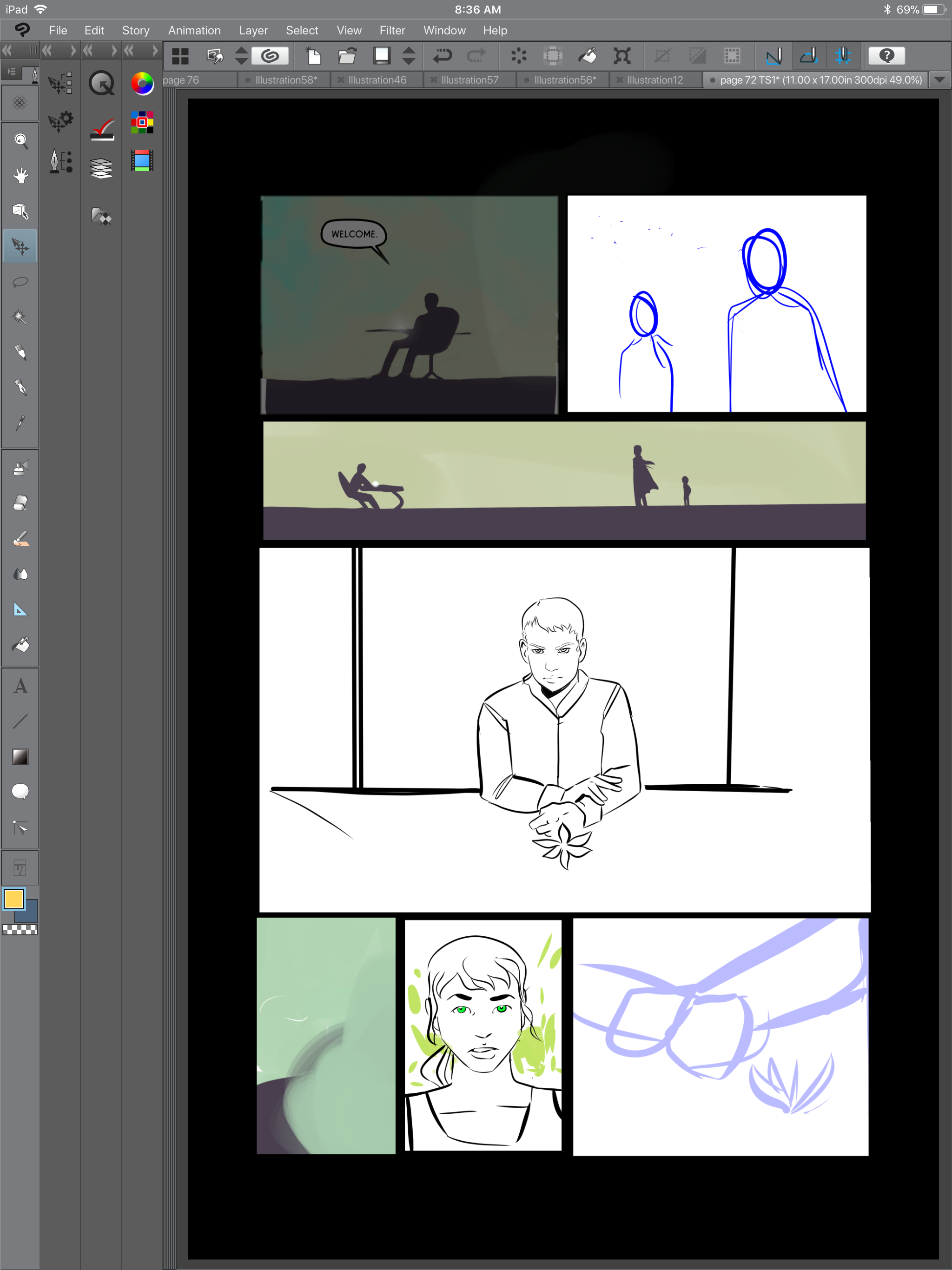
Comic pages for me do not come to life as a slow fade, it’s more a scattershot of areas that resolve and areas that are still-to-be resolved.
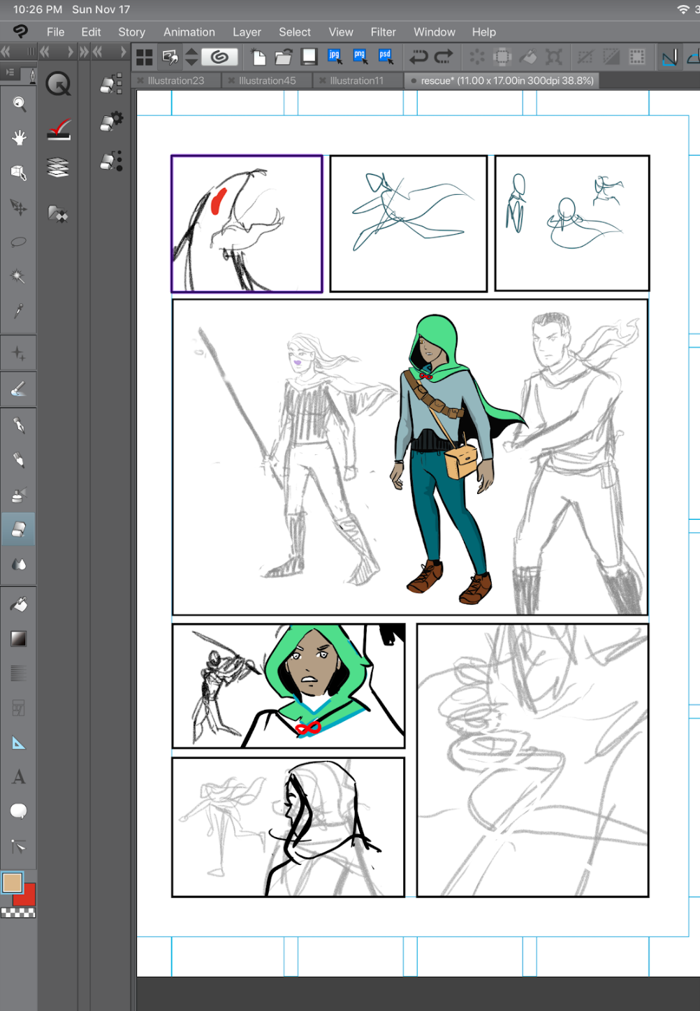
While I can’t say this is the absolute objective right way to make comics, it works for me because I allow myself to draw what I am excited about and work from there. It also helps me get ideas down as quickly as possible before they slip away.
The panel layout below is the very first thumbnails for when Cross finds Grey Eyes.
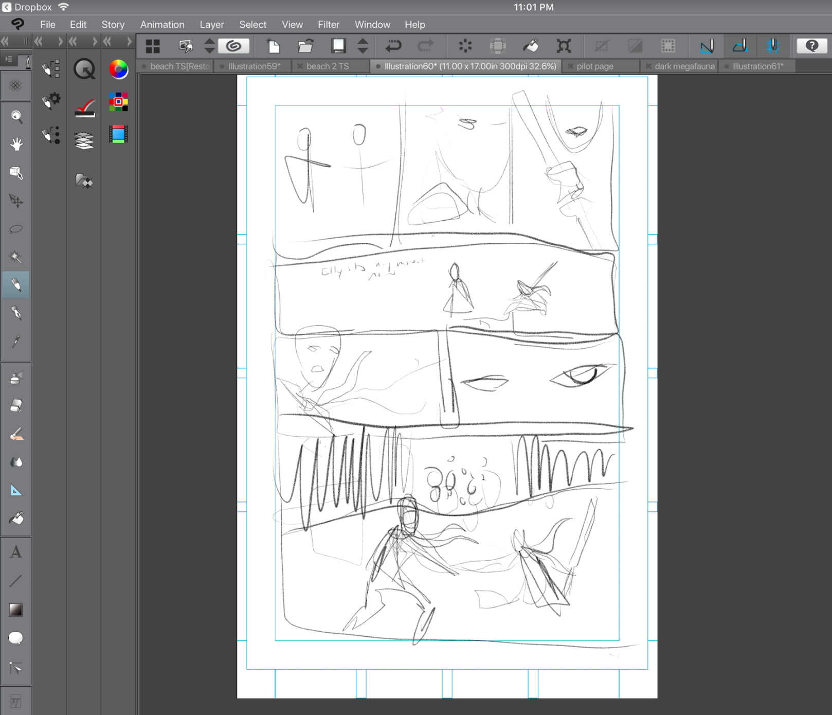
The thumbnails for me are as cruddy as possible, where I am just trying to get the placement right. While I do not write out panels or a script, here is what goes through my head and what I wanted to get into the thumbnails and the page:
Panel 1: all right this is a side to side scene where you can see that Cross is approaching and Grey Eyes is a bit vigilant. She is absolutely not sure how she feels about him.
Panel 2: Grey Eyes has her hand on her chest of patterns, which hasn’t been explained yet.
Panel 3: the same pose for Grey Eyes, but she is clutching her spear (spear was ditched in the final version). It’s a much different place and time.
Panel 4: Environment shot, you can see something in the distance, a wild red cloud. This is the Megafauna. Cross and Grey Eyes are in the foreground. Grey Eyes is sitting down with her spear at rest, Cross is looking mostly into the distance.
Panel 5: Cross looking at camera which is Grey Eyes, telling her to go back
Panel 6: Focus on Grey Eyes, she is determined but it’s not clear yet who she is or why.
Panel 7: The megafauna is clearly getting closer
Panel 8: (Extra panel added after thumbnails) Cross and Grey eyes are looking up, whatever is approaching is very large. Hair, scarves, capes are all flowing in the right direction, there is a lot of wind and movement.

Since a page about Helixers was before this page, I began to introduce how Helixers talk to each other in this page. Helixers are mentally joined, through Interpreters, they share a kind of psychic network together. Morgan is Cross’s Helix Pair, so, Morgan and Cross can send each other messages between themselves and speak silently even while apart, this is a ‘call.’ Morgan speaks or calls in a yellow, Stan-Lee Era comic dialogue box. Morgan is more cheery and optimistic, so I chose yellow to represent his dialogue. Cross is more reserved, so his dialogue box color is pale blue, similar to his eyes. When the Helixers ‘call’ each other, their calls are enclosed in curly brackets, { }.
The upcoming segments of the comic go into a bit more of the ‘why’ behind the existence of Helixers and what they are trying to do, and more about the Dark Megafauna.
Developing the crashed Air City took some time and thought. Earlier in the comic, Sam finds himself on an Air City with Alex, and the purpose and history of Air Cities are explained a bit further in the segments of Cross’s memories as experienced by Sam.

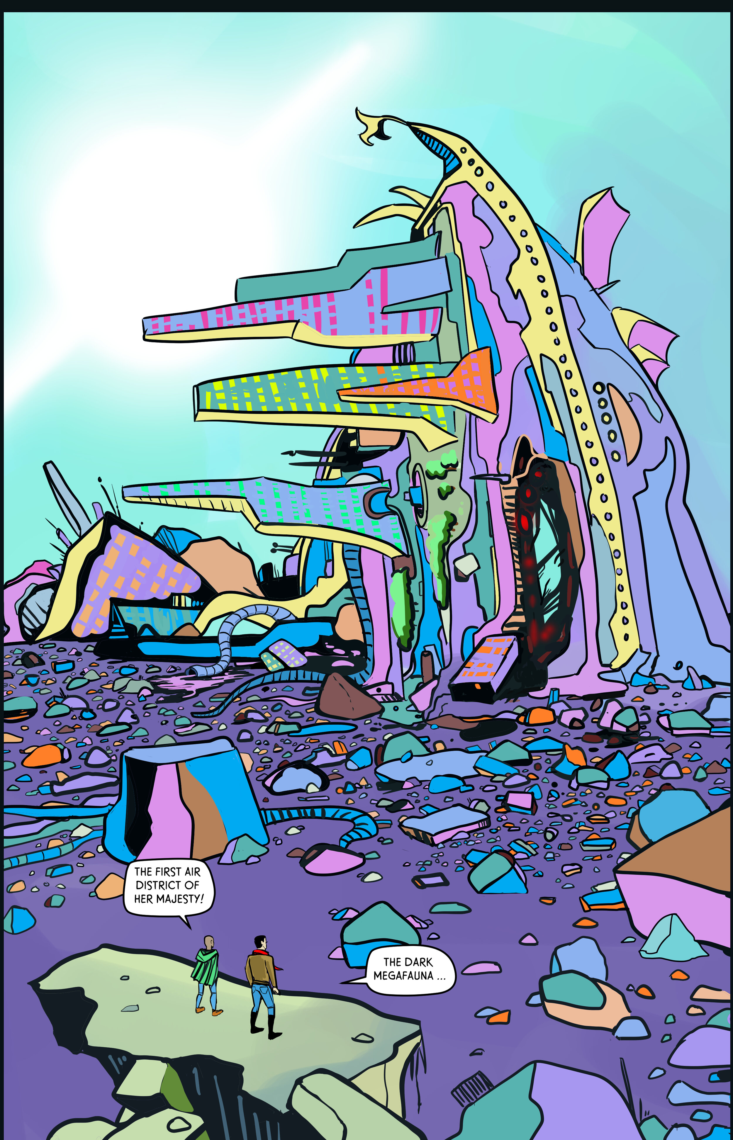
I actually love drawing all of the rocks in pages like these, I just sit on the DC Metro for my commute and draw rocks on my iPad for 40 minutes and try to make each one interesting somehow. Since the Metro can be bumpier it is hard to get work done on character faces or environments, so, drawing rocks is a great tasks for the Metro.
Developing the Dark Megafauna was easy and hard, I wanted it to be an inexplicably huge monster, a bit like the devil in Disney’s Fantasia “Night on Bald Mountain” or the monsters in Shadow of the Colossus.

It has wires coming out of it or strings, and after a while you see why it is glowing.
To get poses right for Grey Eyes I model her more difficult poses myself.
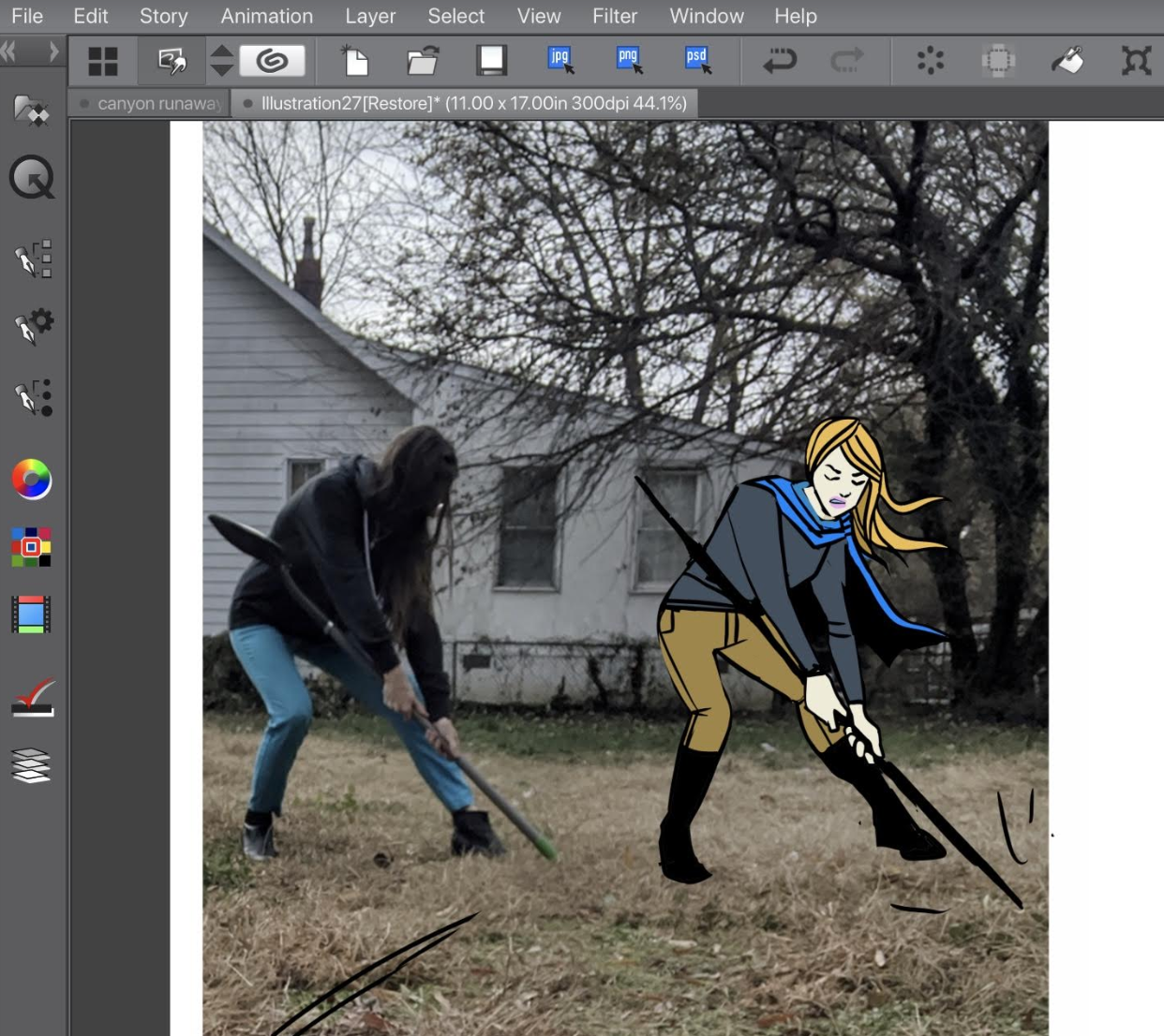
Below is a good example of a page where it got seriously revised, the first two panels completely changed and had to be turned into their own full page, where Grey Eyes removes the spear from the Dark Megafauna.


Here are a couple more process-to-final images

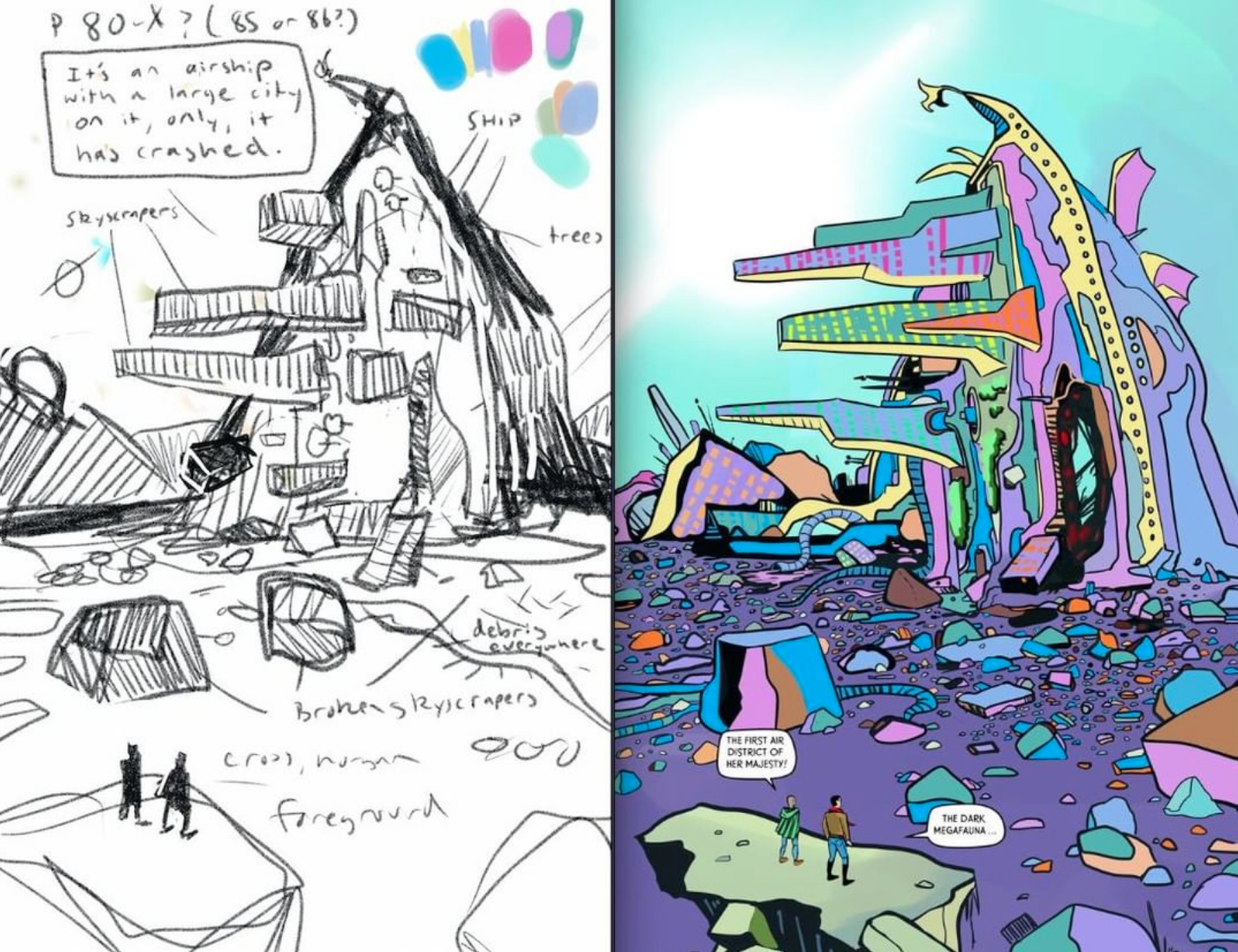

If I have a dialogue-heavy page to do, I usually start making a comics page by
1. Sketching the thumbnails
2. Placing the word balloons
Word balloons take up a huge amount of real estate in a panel, so you have to either plan ahead and map out the balloons, or, you have to prepare for HALF of your artwork to get covered by the balloon!
I do all of the lettering myself, so if I make a mistake in either the art or lettering, fortunately I only have myself to boss around!
Catch you around the site, thanks for reading this process blog!

Howdy to all Space Cowboys and welcome back to another Making of Post! In these posts I lay out EVERYTHING that goes into making this comic.
Here’s what I’m up to and what I’m doing and what I’m thinking about.
Ever have something that you know to be true, but then forget it, and relearn it only after hanging out with friends?
To loosen up before working on Tilted Sun I recently took some advice from my friends and have been doing informal warmup drawings of DnD characters:

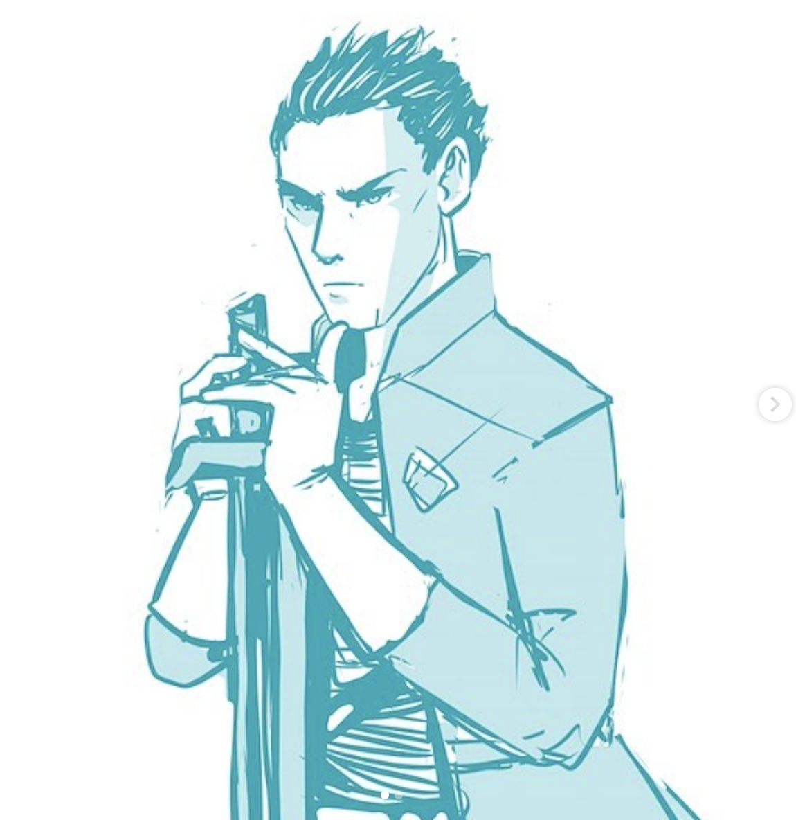

It’s been fun to work on one-off characters to loosen up and get ideas for new clothing designs.
Silliness in art is one of the things I loved most about visiting Tokyo!
Culture is better when art allows itself to be a bit silly instead of when art convinces us that it is Too Serious To Be Touched. It’s nice that people want to dress up and eat cheese and wine in order to see art, but what if we could just see the best art in jeans? Tokyo feels a lot like that. The most excellent art you’ve ever seen is absolutely everywhere.
Anyways, silliness in Anime is one of my favorite things - Full Metal Alchemist and Cowboy Bebop are overall pretty serious shows, but there are extremely funny episodes. Laughter adds to reality in many ways, so I am thinking about how to add more of this to Tilted Sun.
In Japan I picked up the Persona 5 Animations Keyframe Book and also this guide to Octopath Traveler. It’s been fun to leaf through both books and look at character treatments, expressions, and clothing ideas. Not a detail is spared and both series are not overwrought either. You know how some anime can be kind of over the top? I sense a lot of brilliance and also order in these.


I haven’t been able to finish Persona 5 for years, it’s something that happens to me where I just can’t bring myself to finish something that I really like. I did the same thing with Witcher 3. Never finished the game. I just loved it too much and didn’t want it to end.
While visiting Houston I found this old Prince Valiant book from, oh god, 1947, and the illustrations have been nothing short of a front row seat to mastery. The inkwork is so dramatic .
While in Houston I also went to this Van Gogh show, it was amazing. I picked up a copy of The Letters of Vincent Van Gogh and am about halfway through.

He wrote something like 830 letters in his life, all of which were saved by his brother Theo’s wife. It is only thanks to these letters that we know anything about Van Gogh. Overall the letters are almost eerily like what it’s like to be an artist today - a testament to their reality. Like the writings of Marcus Aurelius, van Gogh never intended his letters to be public. They just sing with unperformative reality. The letters also help dispel the myth of the Master of None - Painters can write. Developers can paint. Never listen to anyone who says you can’t do several things well.
Speaking of tech, I’ve been using a new tool called Paperlike after a suggestion from Deadlypeach. It’s been great! Paperlike basically turns your glossy-surface iPad into a surface with more drag and tooth, making it more like paper. Paperlike. Haha. Paperlike Website here and at the bottom of this post.
Clip Studio Paint on the iPad is as dope as it ever was and I’m still playing with the new artificial intelligence coloring feature and working it into the production art for Tilted Sun.

More info about the Clip Studio Paint Artificial intelligence coloring feature here! It’s one of the most popular posts on the Becky Jewell blog.
Here are some screenshots of Tilted Sun pages-in-the-making in Clip Studio Paint:


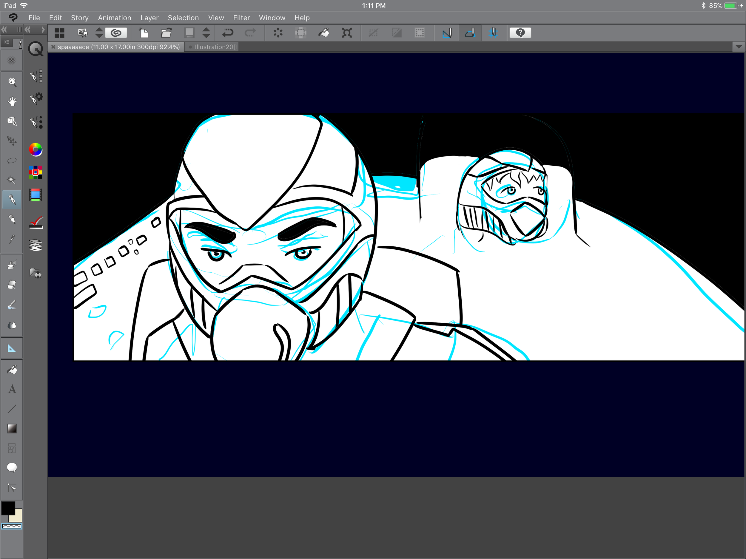


There’s so much more to Tilted Sun on the way, some of the art would spoil the comic. Like some kind of shy fairy, I throw a bunch of little glimpses into the comic onto Instagram, where the art appears for a few moments then disappears, unless you are very dedicated and rewatch the same story over and over again.

My other favorite thing to do on Instagram is to make fun of how I can’t really draw guns. I just am very bad at it! Here is a practice run of some hands and some pretty bad guns
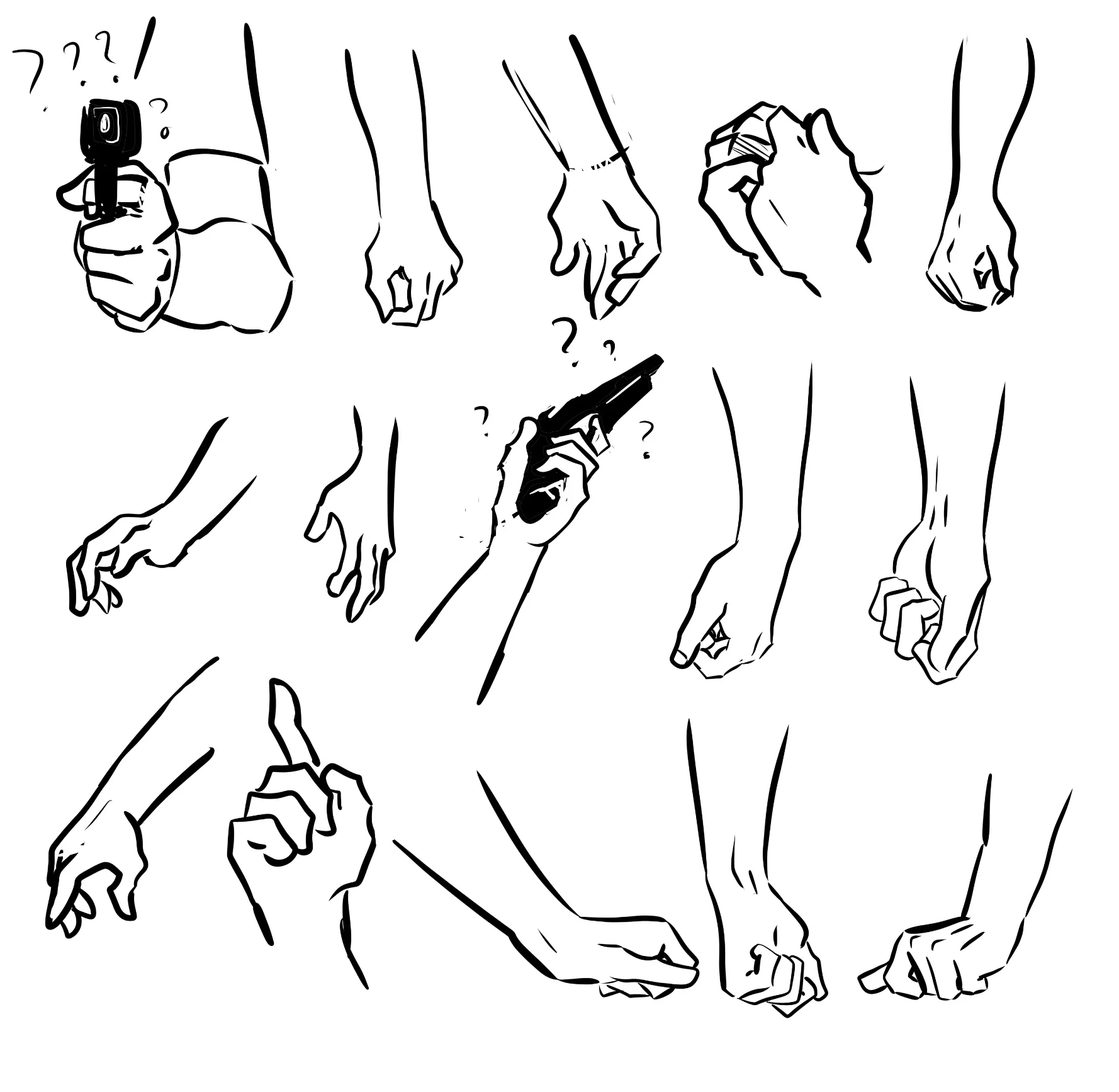
I’m also ramping up my comics skills on another comic, Crow Magnum, which will have some preview art debuting at the 2019 Denver Pop Culture Con! Hope to see you there, I’ll be at Booth A20 with Laurel McHargue.

That’s all for now my friends - this is my braindump of everything on my mind right now. Thank you for reading and I will catch you very soon!
From Dec 20 - Jan 10, 2019
Becky was on Christmas Break! Send many presents, and while you wait for the next Tilted Sun page,
Read this interview with Becky here:
http://voyagehouston.com/interview/check-becky-jewells-artwork/
Write fan mail to the team at ourtiltedsun@gmail.com . Becky and Geddy read every email!
Read about how Clip Studio Paint’s new AI colorization engine is used on Tilted Sun!
https://www.beckyjewellart.com/blog/2018/12/16/clip-studio-paint-185-colorize-feature
Start from the beginning of Tilted Sun Here:
https://www.tiltedsun.com/comic-1/2018/5/5/page-1
Look at this cute picture of Tilted Sun’s production team: Becky and Geddy the Poodle:


To get started I like to make thumbnails and initial sketches for what would be the Pencilling stage in a light blue line. In the traditional on-actual-paper comics creation process, light blue pencil is typically used for under-drawings. The best thing about light blue is that it doesn't get picked up by scanners. When scanned, blue will simply disappear - it can’t get collected by a computer.
Blue is easy for me to see and draw over - I can't imagine drawing thumbnails in light red or light yellow, so it's light blue!
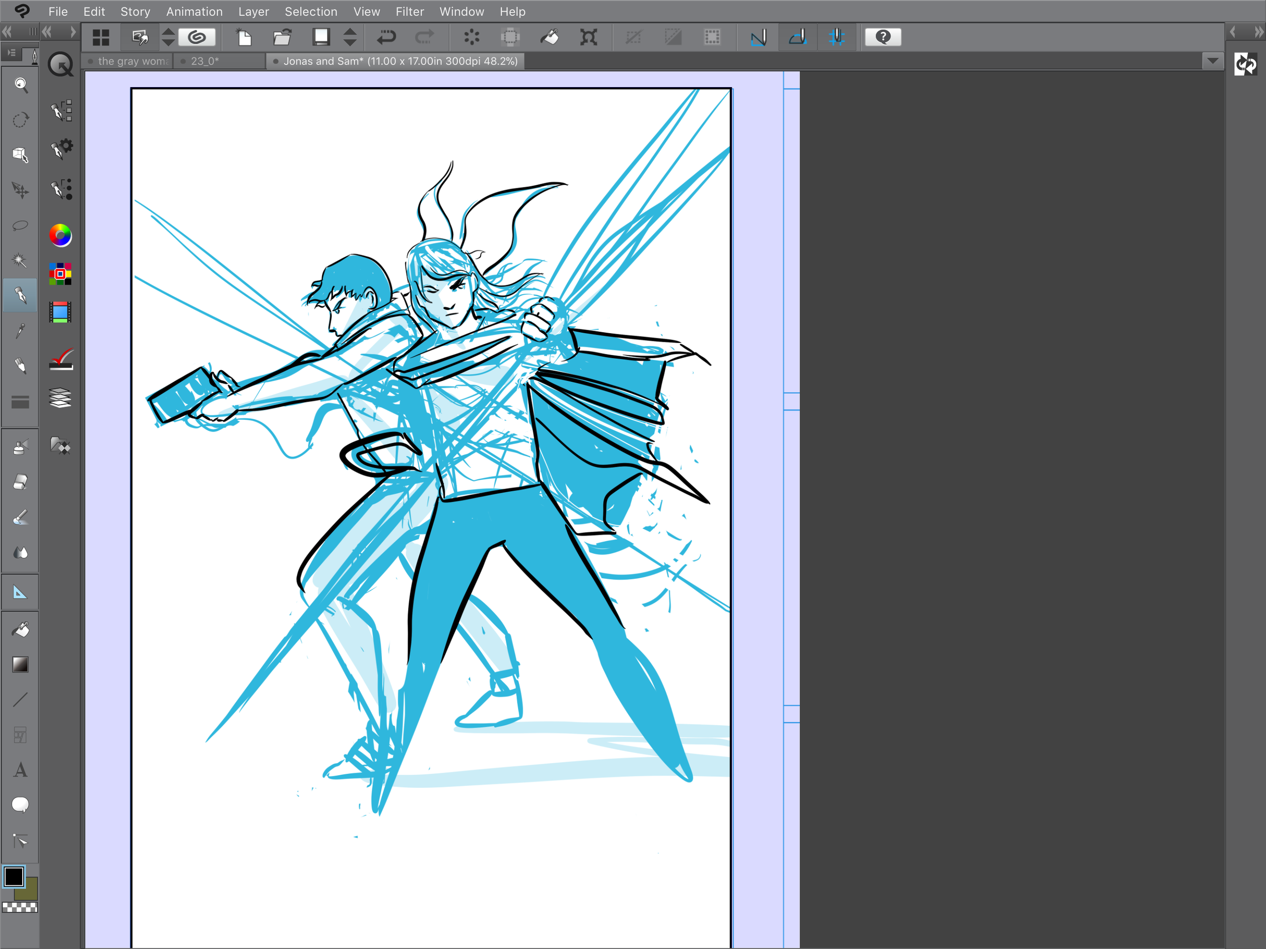
After getting the basic thought of the art worked out in the light blue pencilling line, I start to make commitments in ink. Ink is all about commitment and confidence.
I never really erase the blue line - it stays in it's own layer - and when I need it I turn it on and when I don't need it I make the blue line layer invisible. It is nice to have the ability to see and unsee the original plan for the art and to see how the final inks either deviate or match the original intent.
Before finishing the inks I start adding color, this is probably why I can only work alone. If I don’t see the relationship between inks and colors, something doesn’t feel cohesive about the work to me. At this point the art looks like a mess, but I understand it:

Typically I work top down on art, solving problems in ink from head to toe on the page. It would probably be fine to work more completely, throughout the entire page, but my guess is this is one of those 'to each their own!' kinds of things in art - what works for you is best!
Sometimes coloring on the same layer as the line art feels pretty ballsy. It's a huge commitment. Occasionally I'll use selection cells to color on an additional layer instead of the same layer. This is probably the proper way to color.


I also add opacity-reduced color layers below the ink and blue line layers to get a sense of where the colors will go on the panel, and if the backgrounds make sense overall. Backgrounds and set design have always been very hard for me - I tend to think only in terms of story ideas and characters - I don't automatically consider furniture or environments, so I tend to be very impressed by good set design in comics and film.
Here is the panel with the blue line underdrawing and the inks on to:
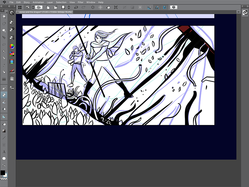
And here are just the inks:
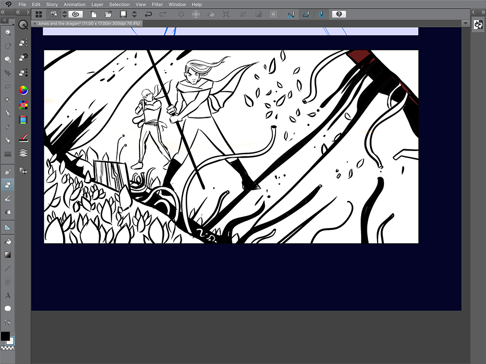
Sometimes I like the blue/black version a lot better than the final ink version - I'm not sure why, I think it is because the blue lines retain a lot of the original feeling and motion that goes into the panel. It's a lot of chaos and indecisiveness, and it doesn't make sense, but the feelings are there, and that matters.
Here are another couple panels where I laid down some blue underdrawings first with inks on a higher layer:


After a couple touchups the final layer looked pretty good!
This is my whole process for making most of Tilted Sun, aside from the writing and lettering!
It’s been a wild ride so far and I’ve pretty much been rehammering the process as I go along. I think it is fine to think actively about art, and to change approaches and ideas, even struggle with art a little bit instead of adhering absolutely to a process.

Hello Awesome Readers! It's time for another post of Tilted Sun Line Art!
All of this lineart is made in Clip Studio Paint on the iPad Pro! Before panels are painted and filled with color, I draw with Clip Studio Paint's 'Mapping Pen' .
Eventually I'd love to get away from black line, but I love the graphic qualities of it for now. With digital art and digital painting, it's as if we live in a future where comics artists can use any kind of ink to make comics (black, yellow, blue) so we should take advantage of it!

I like to paint in background palettes to whatever I am drawing, just to make sure that the colors I have in mind ultimately look cool.
I'm also still in the habit of creating all line art first in a separate document and then dropping the art into panels later on. I don't draw inside the panels to begin with, but since you can resize art, it's a lot like working with special effects and modeling rather than shooting a film with set boundaries. It's a lot of arranging and positioning, where I do like to follow what I think would be a good composition and framing in a film.

You can see I sorta draw the frames in the sketchbook page above - these are just so that I can figure out where the art begins and ends.
Come back for more line art soon!

Welcome to a look behind the scenes at Tilted Sun! This blog features line art before it is colored and arranged in the final production, as well as some process notes!


When making Sam, I wanted him to be a bit unseeable in the earliest parts of the comic, where most of his face would be covered by a hood, goggles, a scarf, and his hair. As time goes on his face and his character get more exposed throughout the story.


I tend to make drawings in a separate document in Clip Studio Paint and then copy and paste drawings into their designated panels. This process helps me feel more free, it also allows me to adjust framing. If the drawing is always separate from the panel, it's easier to feel better about moving the drawing around inside of the frame. There's no bias about initial composition or placement being better. I'm sure that this process looks ridiculous to many comics pros, but it works for me.
Also, I almost always draw with references, with the exception being the Gray Woman and Sam's faces and other character faces. Logger Bird and Orsyn are all drawn from resources such as photos of birds and horses.
On very specific objects things fall apart if I don't user references - for instance: The Gray Woman's impersonator gun is some kind of rifle, and made the mistake of trying to draw the Impersonator without a reference photo and wow it did not turn out so well:

Seriously I could not draw a gun without looking at one to save my life.
Here are a couple cat sketches, all of which are based off of my grandpa's two cats, Flash and Xena.

Later in part 1 a character shows up with a skull for a face. I couldn't bear to fudge the skull or make up parts of it, so I drew from a real raccoon skull. It turned out to be rounder than I thought - sort of between a cat and a dog.

As far as how line art is made, it doesn't start out perfect! I usually sketch out ideas on a light blue bottom layer, similar to sketching out ideas in traditional comics creation in blue pencil. It's fun to use sketches to get a feel for weight, direction, and motion. I can't exactly put into words what I do when I draw, but the best way to explain is in a question. I ask myself: "What does this comic want to do" and from there the art takes over.
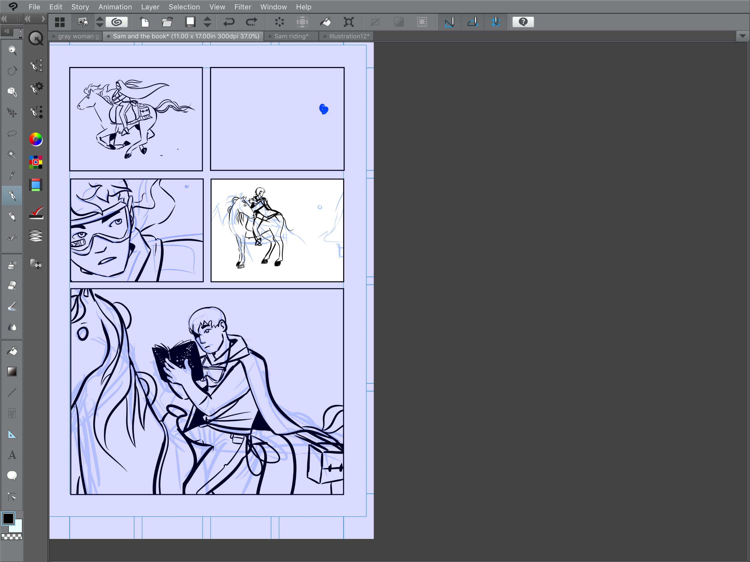
The image above and the image below are both screencaps from Clip Studio Paint (or Manga Studio) on the iPad Pro. You've probably heard me rave about this software before. These screencaps show how I work from blue line into an inked layer or final layer of line art. Nothing at all starts out perfectly, there are a lot of scribbly failed ideas on that bottom layer.
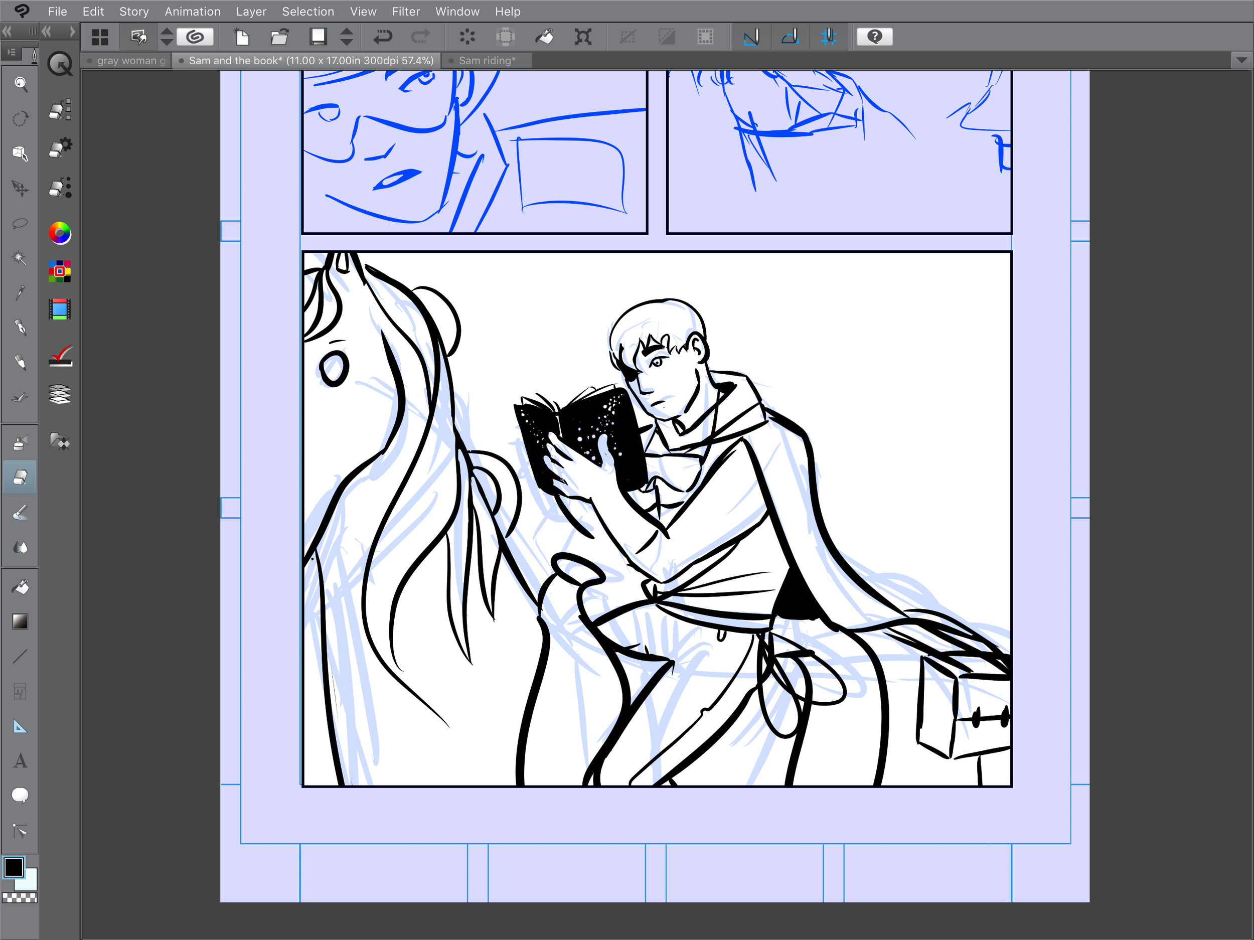
Seriously Clip Studio Paint is so baller.
Since Tilted Sun is in full color, the line art holds a lot less shadow than traditional comics and it's a bit less dramatic. Still, there are moments though where black becomes a powerful point of conceptualization - the stronger the line art, the stronger the final panel.


Comics are an exciting medium in that everything matters - color, line, lettering, panels. Aside from a single two-page comic in an anthology, Tilted Sun is my first comic, so I am learning as I go. It's one thing to read and experience comics, it's a separate beast to create them. As time goes on I'll keep sharing blogs like this one - I'll be as honest as possible because I don't believe that the fake-it-till-you-make-it mode of living helps anyone be a better artist. I don't even think it helps people enjoy art!
While I am bringing my traditional art skills to the drawing table, comics production is still very new for me. Stay with me, I promise you it will get even better. :)
Becky
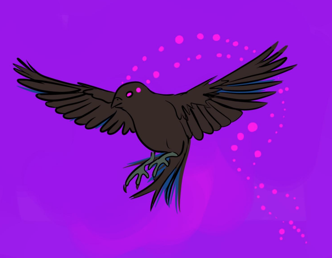
Late concept art for the Logger Bird
THE LOGGER BIRD
The Logger Bird is a creepy-but-kinda-cute little guy who serves The Gray Woman in multiple forms. He keeps track of things and overall watches over The Gray Woman, almost like a drone. Eventually you get the idea that the bird isn't just a bird, it's a computer, and a pretty terrible computer at that. To draw the Logger Bird, I usually use reference photos of sparrows or small land birds - the kinds of birds that nobody would ever notice.

I played with the idea of the Logger Bird having red wings, but ultimately decided that this was too flashy for what the Logger Bird was meant to do. Eye-searing, depthless pink seemed right for his eyes. Later, I added in the trailing effect of his eyes to show movement and also a kind of blinking - it ended up looking quasi-mystical.

ORSYN
As Sam's somewhat-trusted transportational friend, Orsyn gets a lot of screen time in Tilted Sun Part 1. Of all the characters in Tilted Sun, Orsyn seems to be the most diffucult for me to draw, because, horses are weird little guys! They have all kinds of knees and ankles and their noses are pretty funny.


At one point I drew Orsyn with a full harness and bit, and decided to scrap the harness as Orsyn is more of a freewheeling wild horse.
THE TETHER ORB
Part One of Tilted Sun opens with an orb that is pursuing Sam and Orsyn. The orb is tiny, but I wanted to conceptualize it as something very front of mind - it's small and annoying, but to Sam, it takes up a huge amount of mental space. He's heard rumors about Tether Orbs but has never seen one before, and the orb won't stop following him.

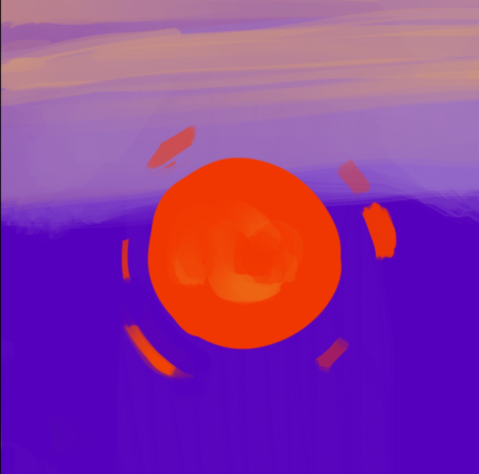
How do you give an orb a personality? Given that it's just an orb for many pages, the orb relies a lot on framing to be communicated - the orb's relationship and placement versus other characters like Orsyn and Sam were the key decision points. It will all make sense later, or not, I promise.
This page below is an almost-completed concept for the world of Tilted Sun. Saturn is now a ringed sun, and Sam, Orsyn, the Orb, and the Gray Woman live on one of the moons of Saturn. In the foreground of this page, you can see the Tether Orb as a tiny dot. In the final version the orb will likely be much more noticeable.

THE STORY SO FAR....
Below is a photo of my studio in Houston in 2017 where I was working with some early layouts for part one. This was before Clip Studio Paint was released for the iPad Pro, and the comic was being made entirely in Procreate using panel templates created in Photoshop.

I liked printing out each page and hanging it up to get an overall feel for how the story would flow. After a while I translated this workflow into Photoshop, where I compiled thumbnails of each page so that I could remember which page went where. Usually, you'd do this in InDesign or in a book format in Clip Studio Paint, but since all I was doing is creating thumbnails, it worked.
I ended up adding a lot of pages in between the pages that you see depicted, and not every panel conceptualization made it into the final cut. If I didn't like something or if it did not look cool, I scrapped it. Everything changed, however, when Clip Studio Paint was released - processes like filling an area with a flat color of paint became a one click process instead of a handpainted deal. Handpainting sounds romantic until you try it with 60 pages of line art...

The next Concept-to-Panel feature will cover some of the other characters in Tilted Sun, including The Gray Woman, Sam, and the guards!

While you're waiting for the next Tilted Sun page to post, hope you enjoy this blog featuring art around upcoming pages, panels, and characters!


HUGE thank you to all of Tilted Sun’s early readers! More pages every Tuesday and Thursday
Read MoreJust some of the line art/inking in Tilted Sun! Enjoy!
Read More
Well, it has been a long time since my last post. What has happened in the last year? What have I been up to? Aside from working hard at my software jobs that I don't talk about that often, I've been painting quite a bit, and have dedicated other parcels of time to writing.
Before launching Tilted Sun on this website I went searching for many tools that would help me create the comic that Tilted Sun deserved to be. I picked out a lettering software, made brushes in Procreate, and I'm lucky to have Marc - who was kind enough to build me a new computer which makes tiny panels as big as the moon.
I was watching a movie last week and was looking at the trees in the movie and how beautiful they were. Suddenly I felt very jealous of filmmakers - they didn't have to draw these trees or animate them, or make them look consistent from panel to panel! They just had to find the trees and point a camera at them. What a nice world they must have, I thought to myself.
The truth, though, is that no good art is easy. Film, comics, paintings, they are all very difficult. But, unlike the major motion picture I was watching lately, comics are something that a single person can produce, which is really pretty amazing. Making a comic is like making tons of little paintings, all of which must relate to each other. It's an art of being the same, but different.
This comic comes with no explanations about what kind of comic it is. This is for the reader to decide. I hope that you will like it.
Tilted Sun is a science-fiction and fantasy comic by artist Becky Jewell.
Tilted Sun © Becky Jewell. 2016 - 2023